If you’re shopping for metal letters for signs, you’ve probably noticed something interesting. Lots of guides explain what the letters are, but not what’s best for your building, budget, or environment.
Luckily, this guide does. In this guide, we’re breaking down the differences between cut metal letters and cast metal letters, including how they’re made, how they hold up, and which one is a better choice for your needs.
The Quick Answer
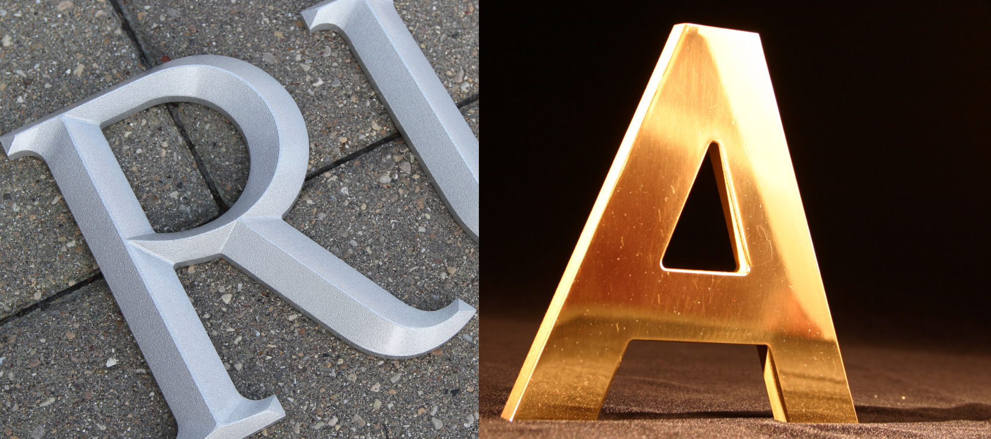
In simple terms, cut metal letters are made by cutting letter shapes from sheets of metal. Cast metal letters, on the other hand, are made from pouring molten metal into a mold to create a dimensional letter with more depth.
Though both are made of metal, the final products can look and feel vastly different. The “right” choice depends on the look you want and the constraints you’re working with.
The Premium Test: What Makes Letters Look “Expensive?”
Before you compare pricing, take a look at the results. Premium metal letters for signs usually have:
- Crisp legibility from the street
- Intentional depth
- A finish that matches the architecture
- Clean mounting
- Materials that age well in your environment
Cut and cast metal letters can both pass the test, as long as you choose the right one for your needs.
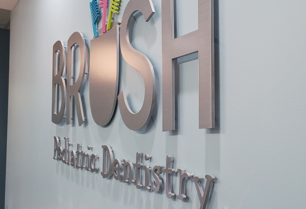
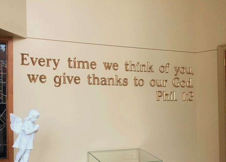
Cut Metal Letters for Signs: Best for Crisp, Custom Shapes
Cut letters tend to feel clean, sharp, and modern. The edges are crisp, and the letterforms can look highly precise, especially for contemporary branding.
This type of metal letter is perfect for when you want:
- Modern design
- Custom shapes
- Tighter control over letter geometry
- A wide range of finishes
Cut letters also offer the most flexibility. You can choose virtually any font or size, and a much broader range of design options than standard cast letters.
However, just like with anything, there are a few tradeoffs to note. If you go too thin, letters can look flat from a distance. Additionally, some metal finishes show fingerprints more easily and require more cleaning to stay looking their best, such as on polished finishes.
Ultimately, the “premium” feel tends to come from choosing the right depth, finish, and mounting method for the space, not just the letter type.
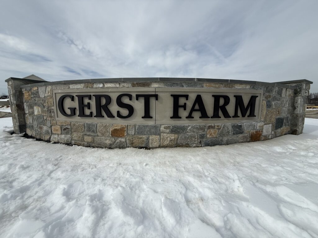
Cast Metal Letters for Signs: Best for Classic, Long-Term Depth
Cast metal letters tend to feel more substantial than cut. They’re often deeper and have a dimensional quality that’s better suited for traditional or institutional spaces.
Cast letters are a strong choice when you want:
- A traditional or architectural look
- More dimensional “presence”
- Heirloom-style durability, such as for building identification
- Standardized cast fonts and sizes that are already available in existing molds
- A classic sculpted look, including prismatic-face letters (a cast-only option)
One of the biggest reasons customers choose cast letters is mold availability. With standard cast, you typically choose a cast font first, then select from the available sizes. When those styles fit the project, cast often gives you more visual depth for a similar cost, making it a great value.
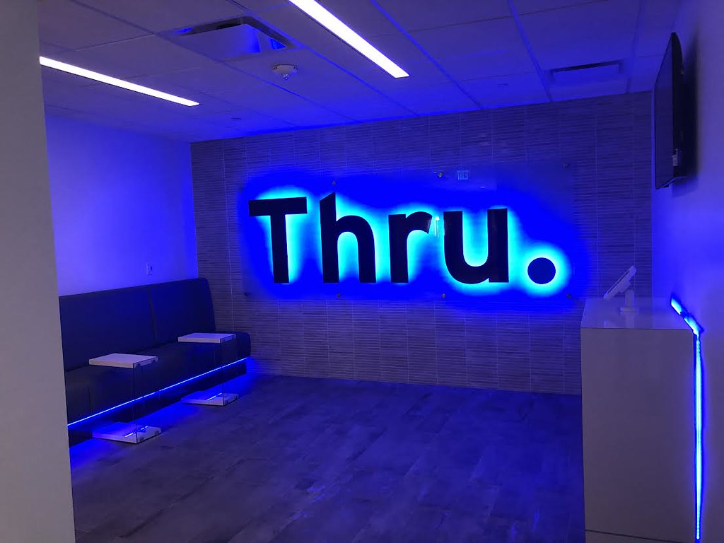
Cast letters can also be produced for halo illumination, for example, creating a high-end halo-lit look that’s perfect for exterior building signage.
Tradeoffs with cast metal letters include limitations in font and size, unless you move into a custom cast option. If you need a custom font or size outside the mold range, cut letters are often a better choice. However, a custom cast is possible for a higher cost if you’re interested in a specialized, premium upgrade.
How to Choose the Right Metal Letters for Signs
If you’re still not sure which one is right for you, ask yourself the following questions:
What style is the building?
Cut metal letters often look best for modern looks, but traditional signs often look better with cast letters.
How close will people stand to the letters?
If people will see your letters up close, such as in a lobby, you’ll want to consider the details and finish more. If it’ll be seen from far away, size, depth, and contrast are greater concerns.
Do you need a custom logo shape or unique typography?
These details are usually easier to get through cut metal letters for signs. If you don’t, cast metal can still be a great fit.
Do you care more about classic depth or crisp precision?
Crisp precision comes from cut metal letters. Classic depth comes best from cast metal letters for signs.
Are you choosing from standard cast styles, or do you need full customization?
Cast metal is a strong fit when available molded fonts and sizes work for your project. If you need a custom font, specific size, or more design freedom, cut letters are usually the better option (unless you invest in a custom cast).
What environment do you live in?
Coastal air, intense sun, and heavy pollution can greatly impact your finish and metal choices more than the cut vs. cast decision itself, but it’s still good to consider.
What will maintenance look like?
If you want to install and forget about it, pick finishes that age gracefully and don’t show every touch or streak. Top finishes for this include bronze oxidized, anodized aluminum, or stainless steel alloy 316.
Don’t Choose Price Before Purpose
It’s normal to start with a budget for a signage investment. But if you lead with price only before deciding what your sign needs to do, you may end up spending more in the long run (or getting a sign that doesn’t feel quite “right”).
Choosing only “cheaper” letters can run you into issues like:
- Letters that look great online, but poor in real life
- A finish that doesn’t match your environmental needs
- Mounting surprises that can change the total costs
- A style mismatch that affects your branding
Because of this, it’s better to start with purpose when choosing metal letters for signs. Ask yourself the above questions, such as, “Where will people see it? or “What will it be exposed to?” You should also ask whether you need full font and size flexibility, or whether a standard cast style and size will work. Once those are clear, your pricing and choices become much more straightforward.
Final Thoughts: We Can Help You Choose Right
Whether you choose cut metal or cast metal letters, both can look premium when done right. The real winner is the one that matches your space and expectations.
If you’d like help narrowing it down, we’re happy to help. Either schedule a consultation or get a free quote by sending us:
- A photo of the wall or building where the letters will be mounted
- The approximate width of the area you want to fill
- Your logo file (vector preferred) or font name
- Whether the sign will be interior or exterior, and your city and state for exposure estimates
- Any must-haves like a halo lit look or dark finish
From there, we’ll point you toward the best metal letter type and finish for a sign that looks sharp for years to come.
