Univision Chicago Rebrands
Sometimes all a company needs is a brand new look, and nowhere is that more evident than the world of television. In an industry so dominated by appearances, coming out with a brand new “you” can help you stay relevant in the eyes of your viewers.
Chicago-based Spanish language network Univision knew this when they called us to help them with their rebranding efforts. Not only were they enacting a nationwide rebranding, they also wanted to revamp their office signage. They knew this would help keep the rebranding front and center, to not only their viewers but to everyone at Univision itself.
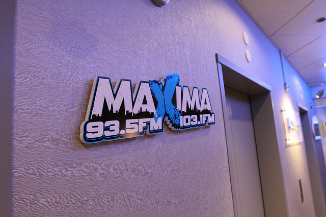
Right as any employee or visitor exits the elevator they’re greeted by three brand new signs: one for the parent company, Univision Communications Inc.; another for Univision America, the company’s Spanish language talk radio network; and Maxima, a Chicago based radio station featuring Spanish music and other programming.
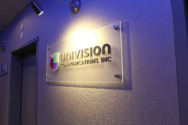
Each sign pops in its own way. The cut acrylic logo assembled to a frosted panel, installed with stainless stand offs of the Univision Communications Inc. signs makes it stand out from the rest with a more authoritative, corporate feel. Univision America’s letters pop out from the wall, accentuating the crisp colors of the logo. Also notice the subtle separation of the AM letters in “America,” showing the radio influence.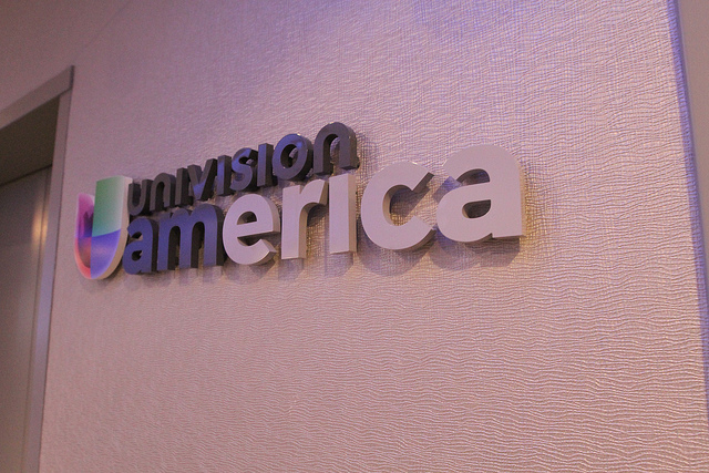 Maxima’s sign is, for lack of a better word, radical, putting the high-octane programming of the radio in focus.
But we’re not done yet. As you step inside, it’s impossible to miss the next big addition to the office. Above the receptionist’s desk we installed an amazing edgelit etched glass sign with LED illumination dimensional, cut acrylic Univision Communications Inc. logo.
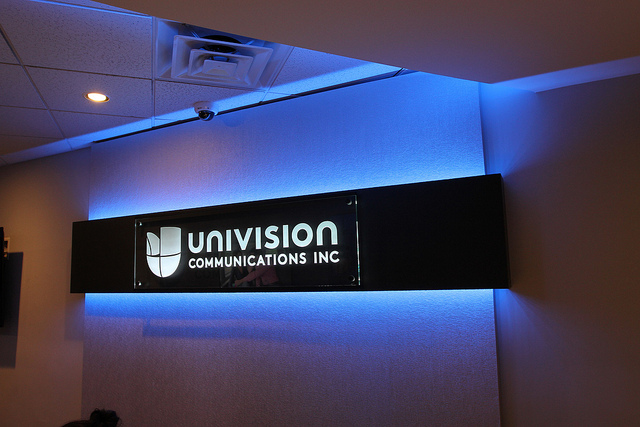
This is really the centerpiece of the rebranding as it sets the tone for the rest of your time in the offices of Univision. Everything about it is eye-catching, including the blue backlight that propels you through the rest of the office and beyond.
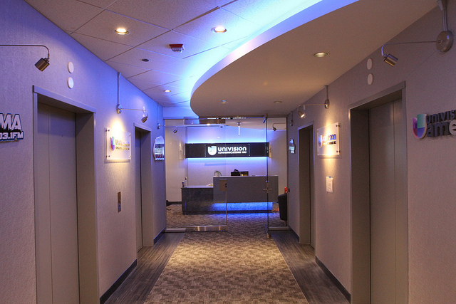
Even from afar it commands your attention. Notice how the blue light leads from the elevator lobby straight to the sign, leading your right into the office. The soft blue is both calming and exciting, perfect for the entertainment industry, while at the same time exudes a positive, business-like atmosphere you want in this kind of environment. It really is a masterful setup, and our signs help complete the makeover.
We wish Univision the best of luck with their business going forward and hope they’ll think of us next time they need help with corporate signage!
Written by Shabbir Moosabhoy